How to Use the Form Widget with Contact Form 7 (Gomax Core)
The Form widget lets you display a Contact Form 7 form inside Elementor and style it to match your site, without writing custom CSS. This guide covers importing demo forms, adding the widget, choosing a design and layout, and editing the form fields.
Step 1: Import Demo Forms
Section titled “Step 1: Import Demo Forms”Before using the widget, make sure you have forms available in Contact Form 7.
- Go to Appearance » Import Demo Data.
- Click Import and wait for the content to finish importing.
- Open Contact » Contact Forms to see the imported forms.
Step 2: Add the Form Widget in Elementor
Section titled “Step 2: Add the Form Widget in Elementor”- Edit your page with Elementor.
- Drag the Form (Gomax Core) widget into the desired section.
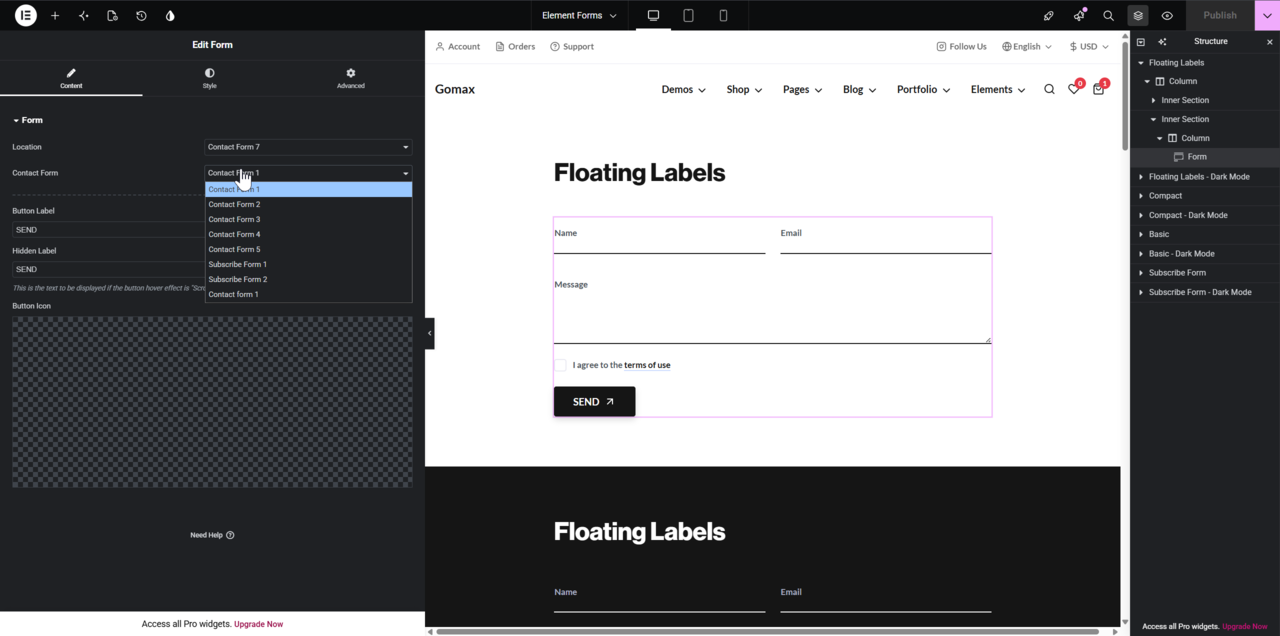
- In the left panel, find the Contact Form setting.
- Choose a form from the dropdown list.
Only forms created with the Contact Form 7 plugin appear in this dropdown.
Step 3: Choose a Form Design and Layout
Section titled “Step 3: Choose a Form Design and Layout”Two widget settings control how the form looks and behaves.
Form Design:
| Option | Description |
|---|---|
| Basic | Floating labels above each field |
| Compact | Minimal style, no labels |
Form Layout:
| Option | Description |
|---|---|
| Stacked (default) | Button appears below the form fields |
| Inline | Button appears beside the input — use only for single-field forms |
Step 4: Edit the Form Fields (Optional)
Section titled “Step 4: Edit the Form Fields (Optional)”To modify the structure of your Contact Form 7 form, go to Contact » Contact Forms, edit the selected form, and adjust the shortcode layout as needed.
Example of a styled form layout:
<div class="form-area"> <div class="form-row row"> <div class="form-col form-floating col-6"> [text* your-name placeholder "Name"] <label class="form-label">Name</label> <div class="invalid-feedback">Please enter your name.</div> <div class="valid-feedback">Looks good.</div> </div> <div class="form-col form-floating col-6"> [email* your-email placeholder "Email"] <label class="form-label">Email</label> <div class="invalid-feedback">Please enter a valid email address.</div> <div class="valid-feedback">Looks good.</div> </div> </div> <div class="form-row row"> <div class="form-col form-floating col-12"> [textarea your-message x5 placeholder "Message"] <label class="form-label">Message</label> <div class="valid-feedback">It's optional, but we'd like to know about it.</div> </div> </div> <div class="form-row row"> <div class="form-col col-12"> [acceptance acceptance] I agree to the <a href="#your-link">terms of use</a> [/acceptance] </div> </div></div>Paste this code into the form editor inside Contact Form 7. The Gomax Core widget applies the styling automatically.
Result
Section titled “Result”The form matches your theme’s design, with no custom code needed. Customize the submit button text, icon, spacing, and layout entirely within Elementor.
Important Notes
Section titled “Important Notes”- The Contact Form 7 plugin must be installed and activated.
- You don’t need to add any extra CSS or JavaScript — Gomax Core handles it.
- Use the Inline layout only when the form has a single input field, such as a newsletter or search form.
If you run into trouble after importing forms, see One Click Demo Import: How to Fix Data Import Issues in WordPress. For more on the Gomax Core widget set, check Gomax Core Widgets: Improve the Page Building Experience with Elementor.